Relevo CC
Year
2021
Deliverables
- Brand Book
Relevo Agency
Relevo is a digital marketing agency specialized in the world of cycling. More than 10 years of experience in the sports sector, specifically in cycling and triathlon. The challenge before us was to combine brand values, to create verbal and visual identity and design a visual strategy for digital activation.
The project idea
“The word Relevo in the world of sports has very positive connotations of collaboration and teamwork towards a common goal. From this concept came the idea of using a graphic gesture in the last letter of the word that connotes a cycle, a turn between two parties that push towards the goal.”
Anna NavarroBrand designer
“The goal of identity is to create the brand architecture that unifies your message across all your digital channels. The agency, specialized in the world of cycling, differentiates itself by creating links through digital channels between companies and their public.”
Bea MartinezDigital Marketing
cycling⚬
cycling⚬
cycling⚬
cycling⚬
cycling⚬
marketing⚬
marketing⚬
marketing⚬
marketing⚬
marketing⚬
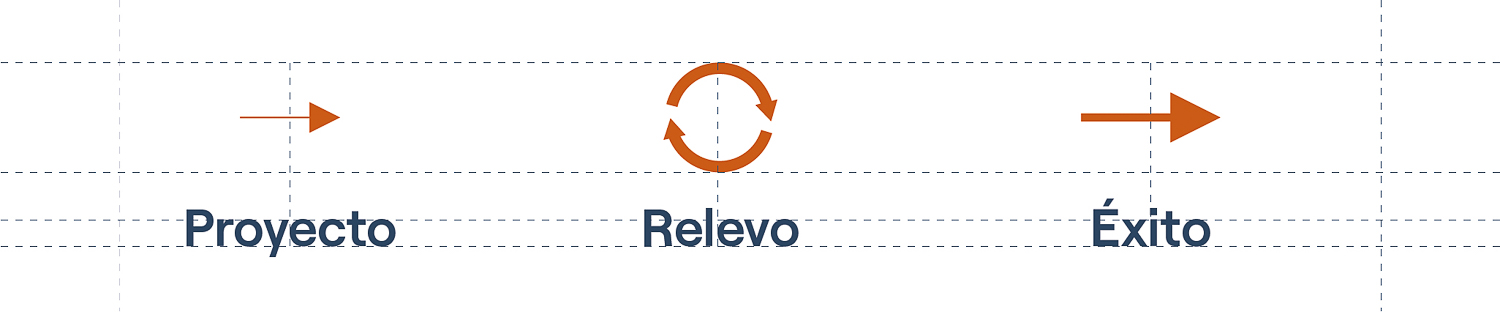
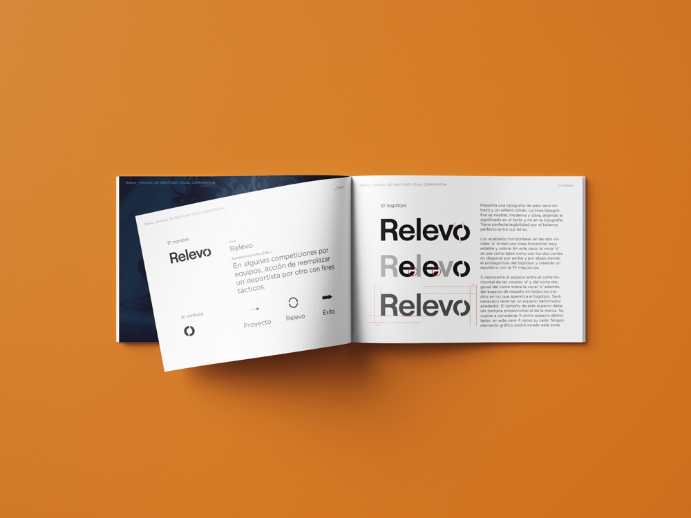
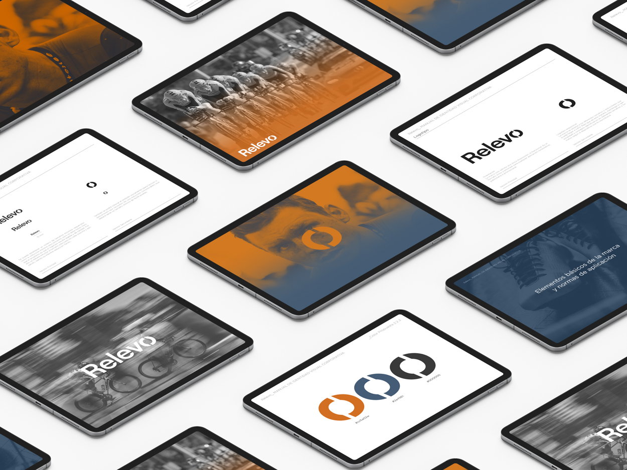
Logo Relevo
The logo responds to the strategy by the organization of the cycle tour to increase visibility and participation. With the logo design, as well as the naming and corporate colors, we wanted to represent the agricultural world, the territory of orange trees and orchards where all cyclists often train.
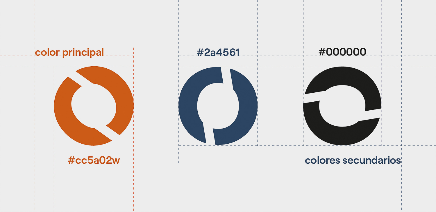
Isotype

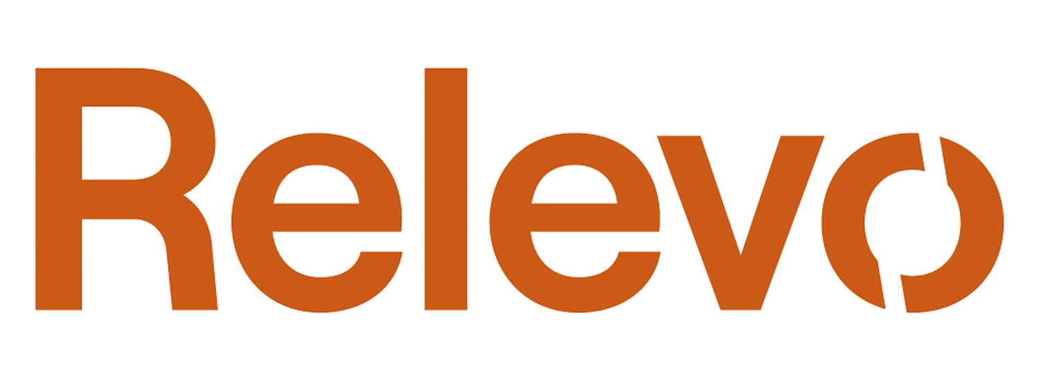
Logotype


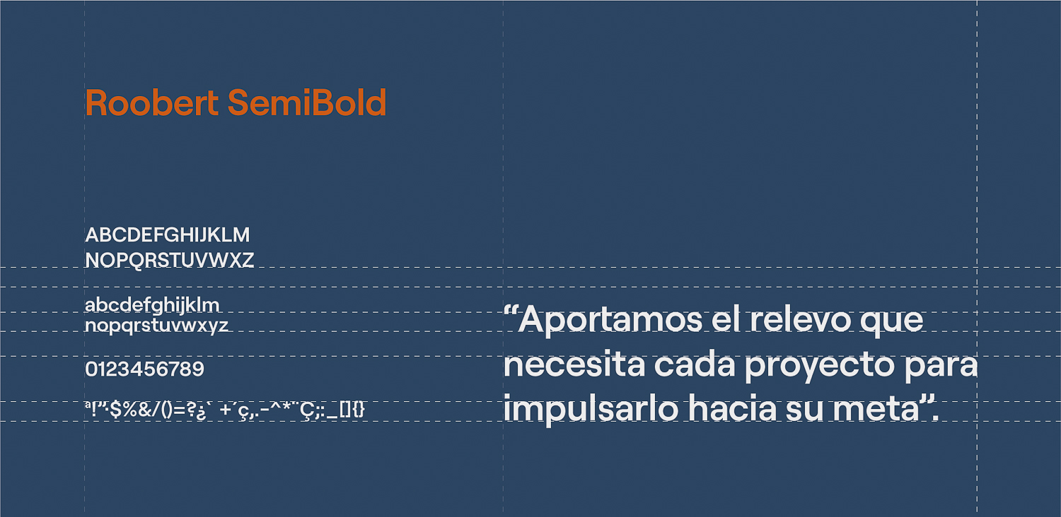
Color & trim
The main color was orange in a very specific tone to communicate the aspects of confidence and success in a digital context. Combined with a dark blue color to convey professionalism and seriousness. With the combination we obtain great contrast to increase its visibility.
Orange #cc5b16
Blue #00604b
Black
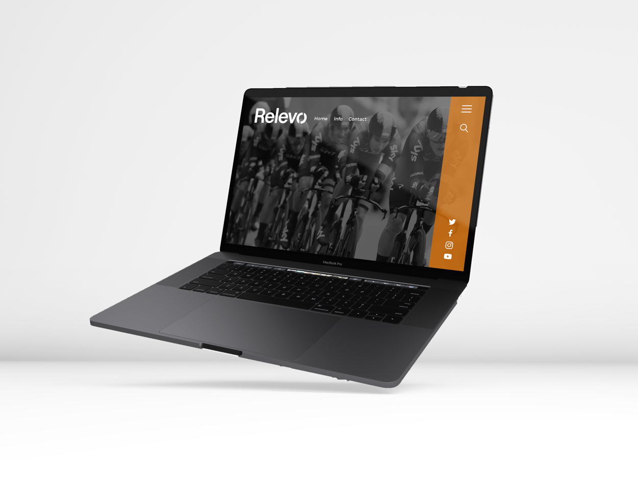
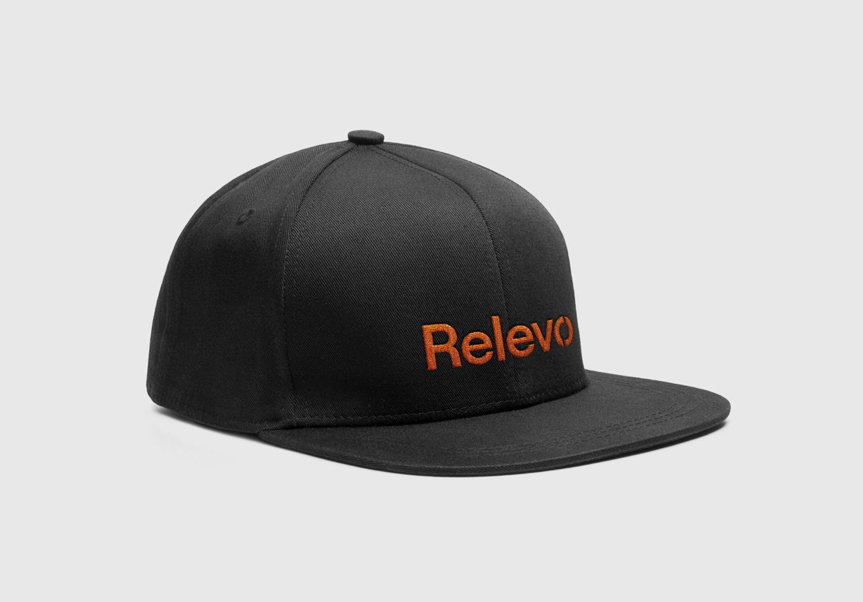
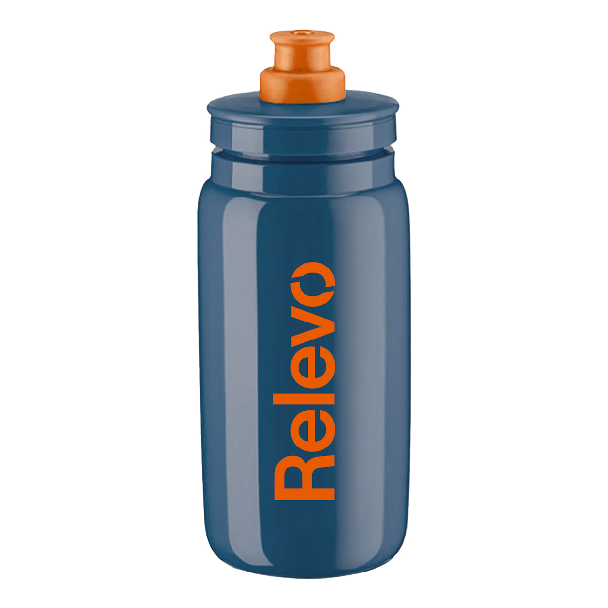
Graphic design and
branding aplications